

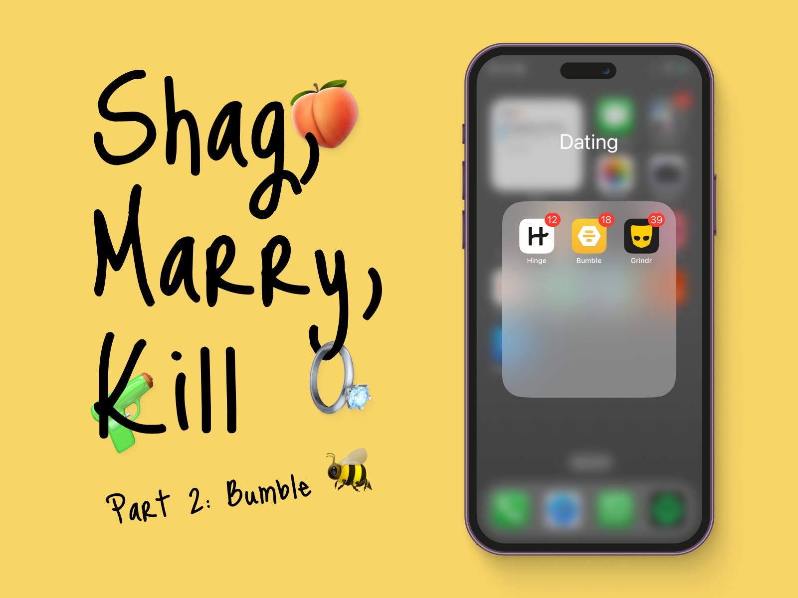
Shag, Marry, Kill: Part 2 - Bumble Design Analysis | How Dating App Design Shapes User Behaviour and Interaction on Hinge, Bumble, and Grindr

Some useful links before you read this post:
Part 1 of this series: design analysis of Hinge of this can be found here
If you’d like to know why I’ve started writing about product design read this
TL;DR
If you’ve not read my post on Hinge, I've decided to shag Grindr, marry Hinge, and say bye, bye to Bumble. Let’s going into why, this week with Bumble.
Introduction
Welcome back to this series on dating app design! In this chapter, we'll be buzzing around Bumble, where swipes, bees, and honey make all the difference. Last time, we explored Hinge's world of connections, but now it's time to enter Bumble's unique hive.
If you've been following my previous blog post, you might recall the disclaimer I shared before delving into Hinge's design. As always, my insights remain subjective. Now, et's take a closer look at Bumble's design and user experience!
My Bumble anthem is obviously from the Queen B herself 🐝
Bumble: Make the First Move™
Bumble's main idea is about encouraging people to be the first to start a conversation. Originally, it was about women taking the lead, but now anyone can do it. They want to create a friendly and inclusive community, which is pretty cool.
The Bumble Buzz: A Visual Delight
When it comes to Bumble's design, I must say, I'm a fan of their yellow and black combo. It has the potential to create high contrast, giving the interface a modern and crisp look. Plus, it fits perfectly with their bee-themed branding, creating a hive of delightful aesthetics.
However, as I buzzed around the app, I noticed some design choices that left me scratching my head. For instance, they introduced purple gradients in some areas, aiming to draw attention and stand out. While I get the idea, from a UI perspective, it feels like a separate entity shouting, "Hey, look at me!" The problem is, in certain instances, the primary yellow colour is more subtle, transitioning from light at the top to a subtle darker shade at the bottom. On the other hand, the purple gradient goes from left to right, creating a disconnection. To create a cohesive experience, there should be a bee-line connecting all elements and making them feel like part of the same hive.
Additionally, I spotted a lot of card elements in the UI. Some act as buttons, while others allow horizontal or vertical scrolling. The main profile matching area even lets you scroll within cards. Now, don't get me wrong, cards can be a sweet design choice, but there seems to be a lack of consistency in their use. I think Bumble would benefit from defining more granular rules for cards' usage. This way, their design would be more predictable and user behaviour within the app would flow smoother. A well-organised hive keeps the bees happy and buzzing harmoniously!
Navigating the Bumble Messaging Maze
Steering away from the UI design, I delved into Bumble's messaging, there's a lot going on! Let's break it down.
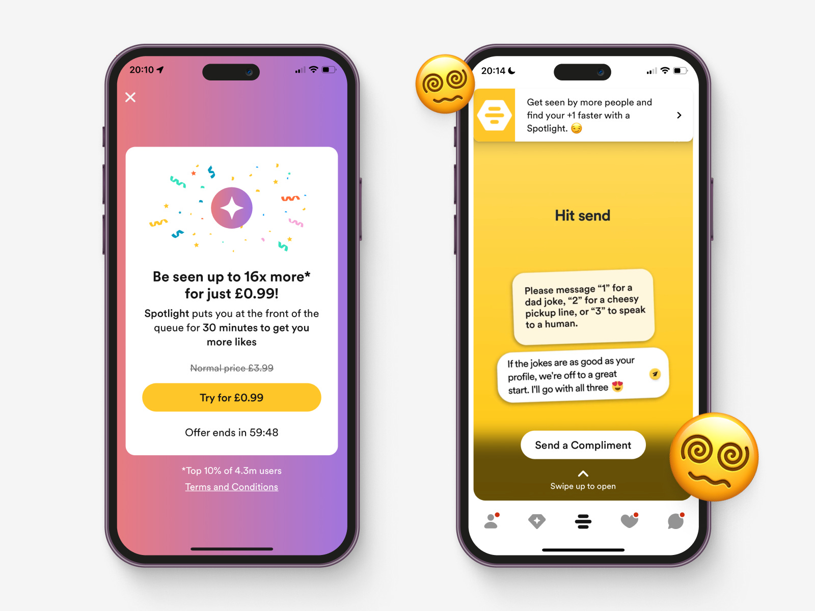
On the left screen in the image above, I noticed that Bumble is a bit trigger-happy with the confetti. While it's a fun element to celebrate success, it should be reserved for noteworthy achievements. For example, when users successfully purchase the Spotlight feature or if they manage to secure a spot at the front of the match queue, then bring out the confetti! That way, it feels more special and meaningful.
Buzzing to the screen on the right in the main matching area. Bumble sometimes throws a lot at us, like a swarm of ads trying to catch our attention. They use videos to promote various features, but the resolution isn't always top-notch, making it feel a bit tacky.
The main issue I encountered here was confusion overload. A banner advertising the Spotlight feature competes with a fast-moving video showcasing Compliments, a new feature they recently rolled out. To add to the confusion, there's a "Send a Compliment" button and "Swipe to open" help text below it. I found myself asking, "Do I click the Spotlight banner, watch the video, tap the button, or scroll to open?" It's a design buzz fest.
What Bumble needs is a more coherent approach to guide users seamlessly through these features. Instead of juggling separate design patterns for different elements, they could create a smooth flow that entices users to explore further. Teasing continuation with additional content under the video could keep users engaged and eager to explore features.
Best Bees: A Sweet Idea with a Sour Taste
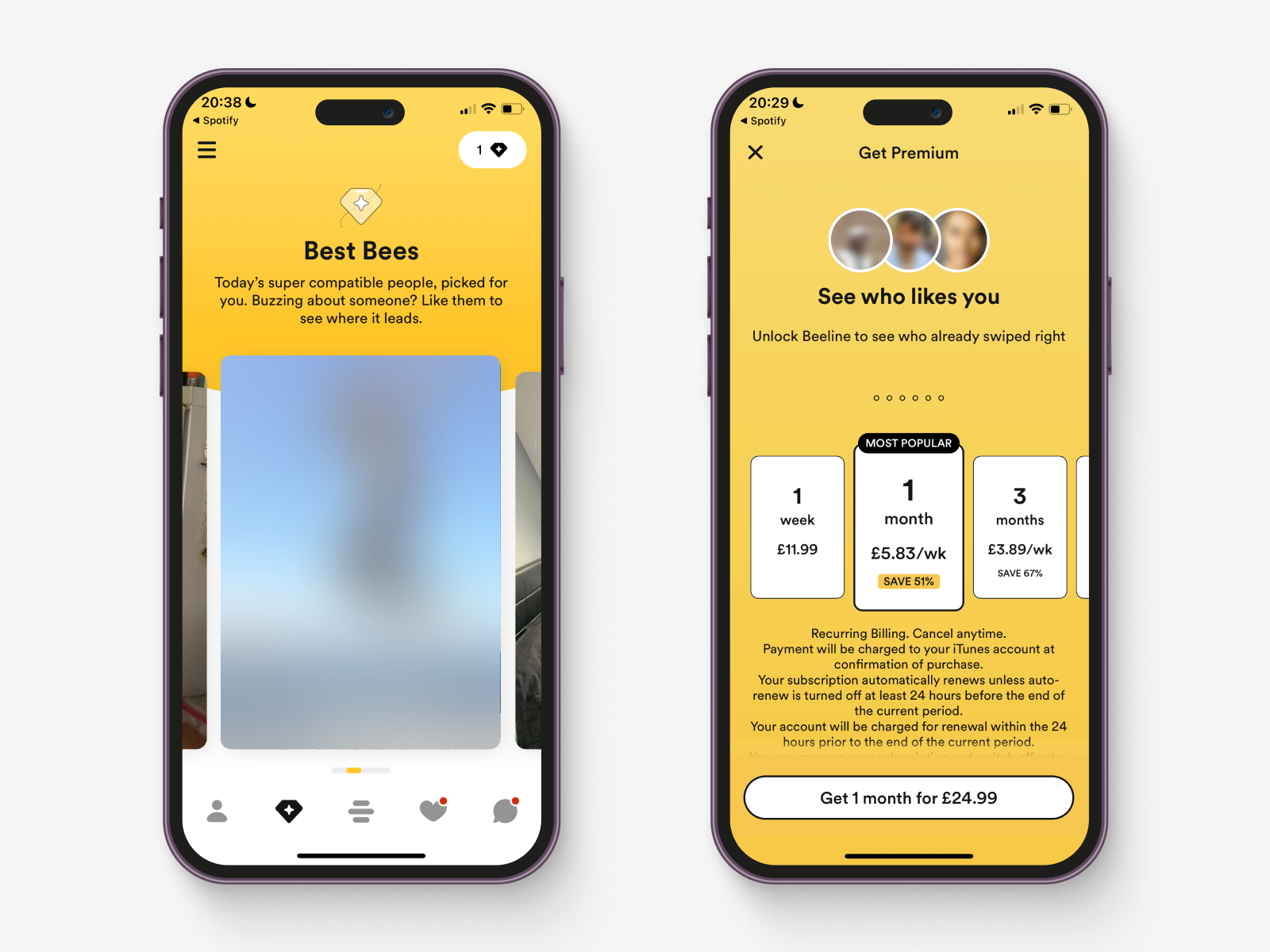
Bumble's "Best Bees" section is their take on Hinge's "Standout" screen. Here, they curate a separate screen with profiles they believe you'll be highly attracted to, using their matching algorithm. The catch? It's a clever tactic to entice users to upgrade to a paying membership.
However, as I buzzed through this section, I couldn't help but feel a bit disappointed. Unlike Hinge's Standout screen, which often showcases profiles that genuinely catch your eye, the Best Bees' choices left me scratching my head, again. The profiles seemed quite different from what I would consider a great match for me. It appears that Bumble's algorithm is having a tough time grasping my taste preferences. The app previously displayed a message, asking me to like more profiles so they could "understand" my preferences better. Honestly, I had a good laugh at that! How can I like profiles that don't resonate with my preferences in the first place?
Zooming in on the top right corner of the Best Bees screen. There, I found a button with a number one and a diamond icon inside it. My initial assumption was that I had one free profile to swipe right on. Well, turns out, that wasn't the case. Instead, I was taken to a "Get Premium" screen. Buzzkill! It left me wondering why they didn't contextualise the messaging to the screen I just came from. It would make much more sense if they immediately highlighted that a premium membership grants access to the profiles within Best Bees at no extra cost. Unlike Hinge, which forces you to purchase expensive roses just to start a conversation, Bumble could win users over by being more transparent and contextually relevant in their upselling efforts.
Instead of serving general messaging about premium benefits, they could focus on the added value that comes with accessing Best Bees through their paid plan. A more contextual approach would likely lead to better conversion rates and happier users.
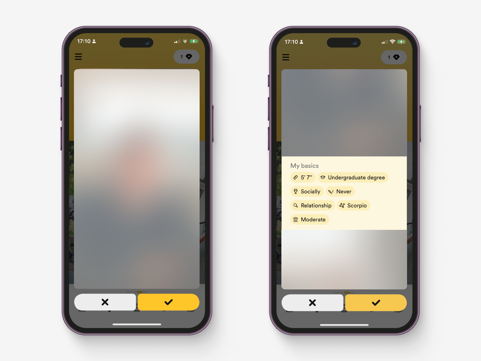
When Clicking on a Profile Card: A Change in Interaction
When you tap on a profile card within the Best Bees section, it slightly enlarges and takes the foreground. Here, you're presented with two buttons to either dislike or like the profile. What struck me as puzzling is that they don't use these buttons anywhere else when matching profiles. This change in interaction pattern left me wondering why Bumble deviated from their usual swiping mechanism.
In my opinion, they would be better off sticking to the swiping method throughout the app. It helps users maintain a consistent mental model, ensuring a smooth and intuitive experience without having to learn a new behavior specifically for profile matching in the Best Bees section.
My biggest gripe, though, is the lack of teasing continuation. Initially, I assumed I had to decide whether to like or dismiss a profile based solely on one picture. That's a lot of pressure to make a snap judgment without knowing more about the person. Bumble should consider teasing additional content beneath the profile, encouraging users to swipe or interact further for a more comprehensive view.
To make matters worse, the subtle white scroll indicator in the top right of the profile card doesn't provide enough contrast on lighter photos. It's a small detail, but it can be quite frustrating, especially when trying to navigate through profiles smoothly.
On a more interesting note, when Bumble presents their premium upsell screen, they choose to display prices in costs per week. I wonder if this strategic decision has anything to do with users anchoring pricing against popular streaming platforms like Spotify or Netflix. By showing prices weekly, users may not directly compare them to other services, but rather to other dating apps. 🧐
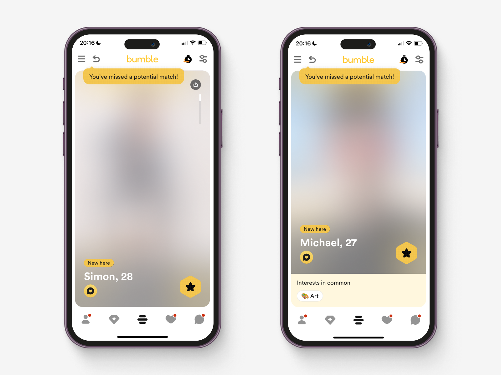
The Matching Section: Swipe Right or Left, but Beware of Missed Potentials
The heart of Bumble lies in its matching section, where profiles appear, and you can swipe right to signal your interest or left to dismiss them. Of course, for a conversation to begin, the other person must swipe right on you too.
Now, here's an interesting twist. When you swipe past a profile that has swiped right on yours, a tooltip pops up in the top left corner, pointing to the back button and saying, "You have missed a potential match." The idea behind this feature seems reasonable—you might want to go back to a profile that caught your eye, especially if you've been swiping quickly and missed the chance to connect.
The "missed a potential match" tooltip seems a bit puzzling, particularly if users are swiping through profiles at a normal pace. It makes one wonder: Do users really go back to profiles they initially dismissed just because they've been alerted that someone likes them?
If the goal is to enhance the user experience and increase the chances of meaningful connections, this feature may not be hitting the mark. Users typically swipe through profiles with a sense of purpose, looking for matches that genuinely resonate with their preferences. The introduction of the "missed potential match" element might cause users to second-guess their swiping decisions, disrupting the flow of the experience.
Bumble could consider more effective ways to help users discover and connect with potential matches, without introducing unnecessary complications. Perhaps instead of emphasising missed opportunities, they could focus on highlighting profiles that are likely to be a great fit, making the matching experience all the more enjoyable and helpful.
Compliments: A Charming Addition in Need of Refinement
Bumble recently introduced Compliments, a feature that caught my attention through its widespread marketing across London. Although I believe it's a recent addition, it's possible that it has been around for a while, just flying under my radar. This concept shares some similarities with Hinge's idea of starting a conversation over a specific part of someone's profile, but on Bumble, it's all about complimenting photographs. It's undoubtedly a lovely concept, but it feels a tad rushed, like it was released hastily without receiving its final touch of finesse.
Sending and receiving compliments should be a heartwarming and meaningful experience, encouraging users to shower each other with kind words. However, Bumble falls short in delivering a special interaction. Instead of providing prompts or advice, they present a simple text box, leaving users to wonder how best to express their appreciation.
Additionally, Bumble puts up two roadblocks around this underwhelming feature. If you receive a compliment and don't have a premium membership, you're unable to see it immediately. Instead, you're faced with the option to either pay to view the compliment or swipe right on the sender's profile. These hurdles can be quite inconvenient for free plan users and may deter them from fully embracing Compliments, diminishing the potential for meaningful connections.
Just imagine if Bumble could infuse Compliments with some design magic, turning them into delightful gifts for the recipients. Such a transformation would undoubtedly make the feature more enticing and worth exploring, even for those hesitant to invest in a premium membership.
On the top right corner of the app, Bumble lets you know how many Compliments you have left to send. However, it's unclear how you can top up this count. Is there an option to pay extra for Compliments, similar to Hinge's roses, or are Compliments exclusively reserved for premium members? The lack of clarity might leave users unsure about the value of this feature and whether it requires an additional payment.
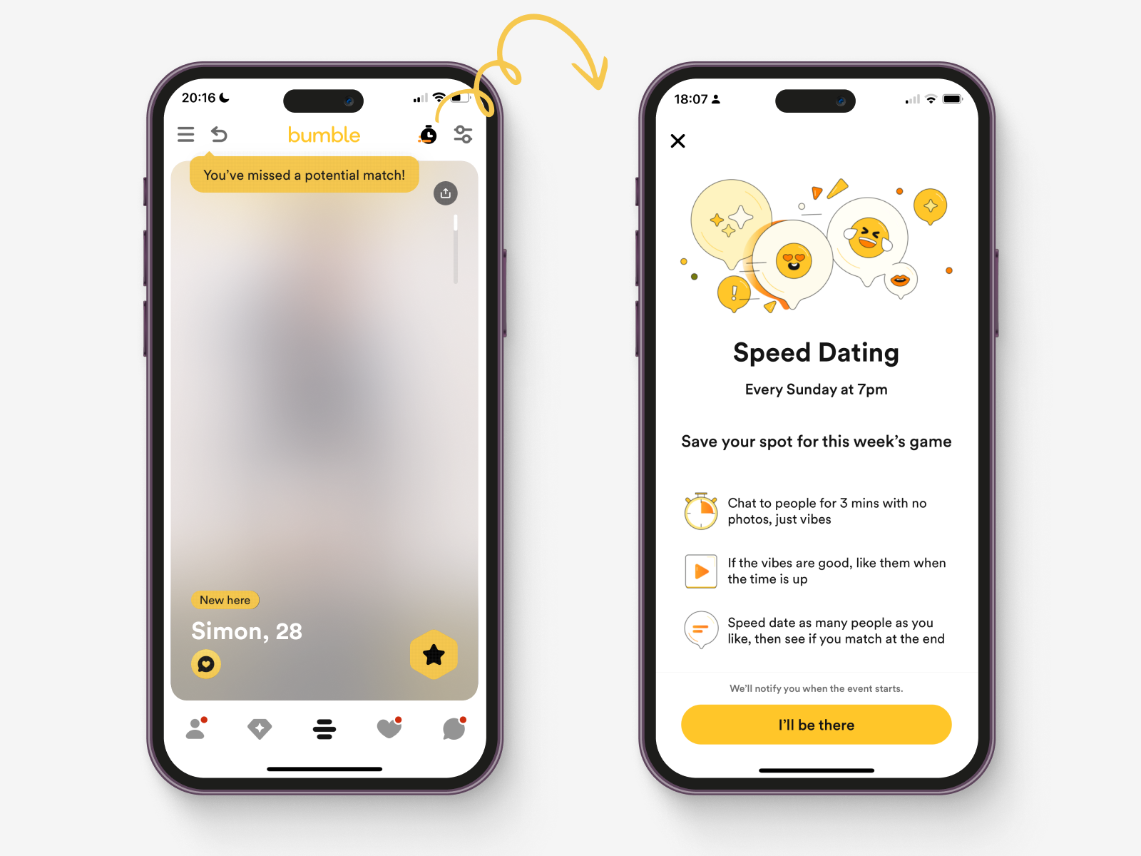
Speed Dating: A Fun Innovation, Yet With Room for Improvement
Bumble's Speed Dating feature caught my attention, and it seems like a really enjoyable addition that aligns with the type of innovation I appreciate. The idea of trying it out certainly appeals to me. The concept of anonymity, where only photos are shown, adds an element of excitement to the experience. However, I do have some reservations about Bumble's ability to match me with someone who truly suits my preferences. As of now, they haven't proven their in-depth understanding of my tastes, which makes the idea of anonymous speed dating a bit daunting.
For now, I might hold off on trying the digital speed date until Bumble fine-tunes their matching algorithm to better grasp my preferences. Nevertheless, I must commend Bumble for introducing this feature, as it has the potential to create a fun and engaging experience, possibly leading to a habit-forming activity within the app because it sets a clear time when the speed dating takes place. With some improvements in their matching capabilities, the Speed Dating feature could become even more enticing, making it an excellent addition to the platform.
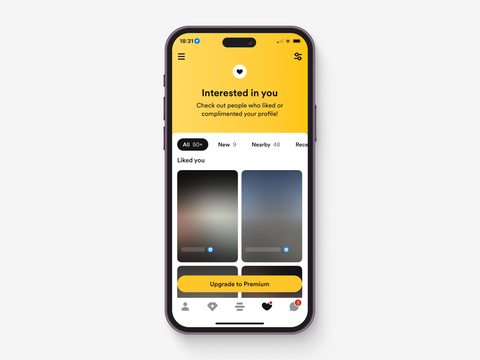
Interested in You: A Comparative Look
Both Bumble and Hinge offer a feature where you can view the profiles that have swiped right/liked you. However, there's a key difference in how these apps present this information to their users. In Hinge's case, where there's no swiping mechanism during matching, the Likes You section displays all the profiles that have expressed interest in you, you can go through them one by one, without requiring a subscription to Hinge+ or HingeX. On the other hand, Bumble utilises its swiping system to upsell this feature, enticing users to explore the section by initially hiding all the profiles behind a paywall.
Personally, I've never found this type of hidden profile section particularly appealing or tempting. This sentiment might be influenced by my experience with other apps like Grindr, where matching doesn't follow the same approach as Hinge and Bumble. Consequently, I don't feel a strong inclination to see who has swiped right on me, as it doesn't resonate with my user behaviour from other platforms.
While the interested in you feature is an interesting addition to both apps, its execution can vary. Hinge's allows you to go through your potential matches without any additional cost (unless you want to see them all at the same time), fostering a more inviting environment. On the other hand, Bumble's approach, while it may be a source of upselling, could potentially discourage some users from engaging with this section, as it feels like they are missing out on a hidden aspect of the app. Striking the right balance between incentivising users and providing an enjoyable experience will be crucial for both Bumble and Hinge as they continue to refine and optimise their respective interested in you features.
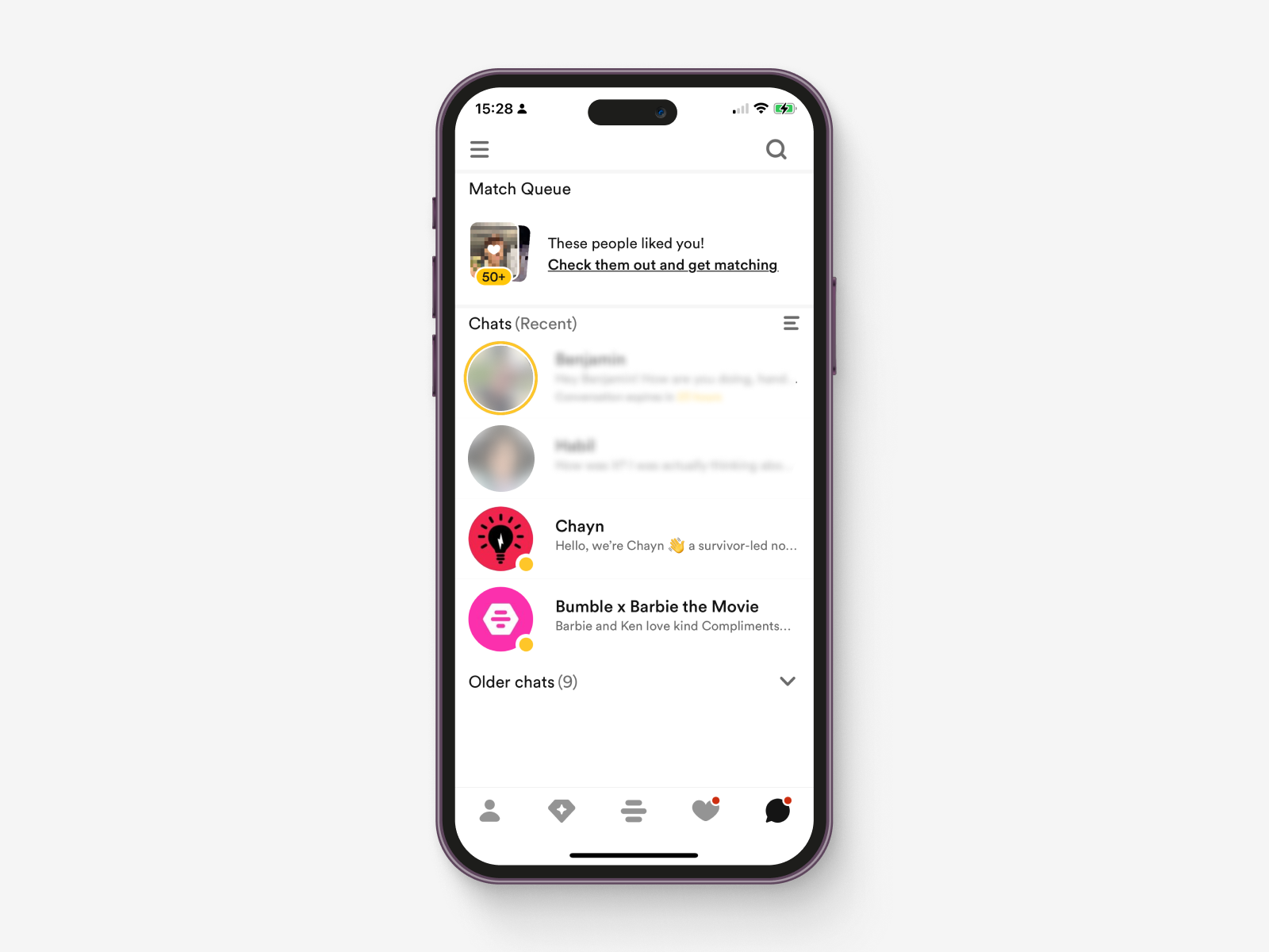
Messages: A User Experience Perspective
The messaging layout in Bumble is very similar to Hinge, with a similar feature of separating recent chats from older ones. However, I must admit that I'm not the biggest fan of this design choice. The practice of hiding potential matches and creating friction to resume conversations can be frustrating. Instead, I would prefer a separator that allows me to see all my chats, including older ones. Sometimes, I might want to take a break from Bumble or go on holiday, and having control over my messages would be much appreciated.
Recently, I discovered a matching queue at the top of the messages list, where prospective matches are tantalisingly teased to users. Initially, I mistook this for an ad, as anything outside the regular chat area tends to feel spammy and gets overlooked. The same goes for messages sent by Bumble themselves; I usually ignore or delete them right away. As a user, I believe the messages section should be exclusively reserved for my matches. Mixing in other elements starts to feel intrusive and cheap, diminishing the overall messaging experience.
Bumble employs an interesting feature to keep conversations going. After matching with someone, both parties have 72 hours to respond before the profile gets moved to the hidden section at the bottom. This strategy serves multiple purposes: it encourages users to actively engage in conversations, prompts them to be more selective in their matches, and ensures they regularly check their messages before the 72 hour window elapses. It's a clever way to create a sense of urgency and maintain user activity within the app.
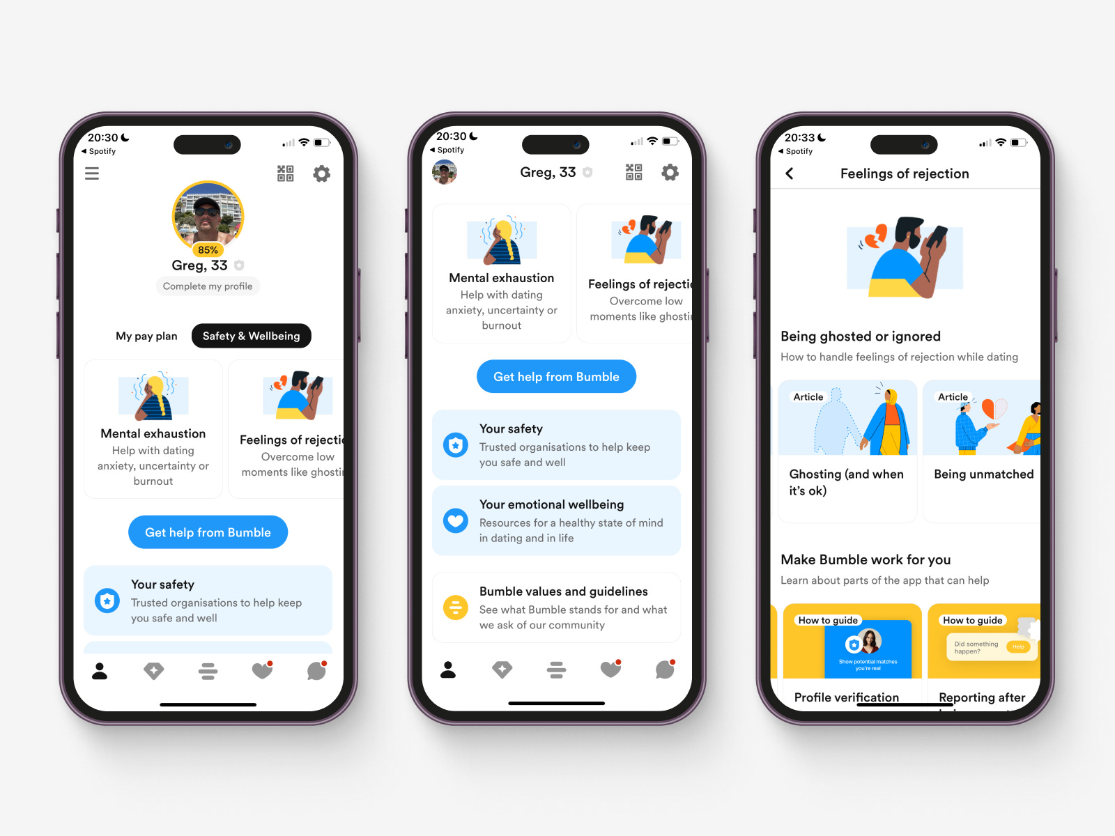
Safety and Wellbeing: A Clever Lever for Enhanced Dating
Bumble's Safety and Wellbeing section, housed in your profile, is a feature I really appreciate. The tips and suggestions provided are invaluable, especially for those new to dating. They encourage users to approach dating and craft their online profiles on Bumble in a more thoughtful and considerate manner.
By offering such resources, Bumble not only helps users feel safer on the platform but also empowers them to create profiles that stand out. It's a clever way to foster a positive and secure dating experience for everyone. If Bumble can't address certain concerns directly, these resources guide users in the right direction, ensuring they have the necessary support when needed.
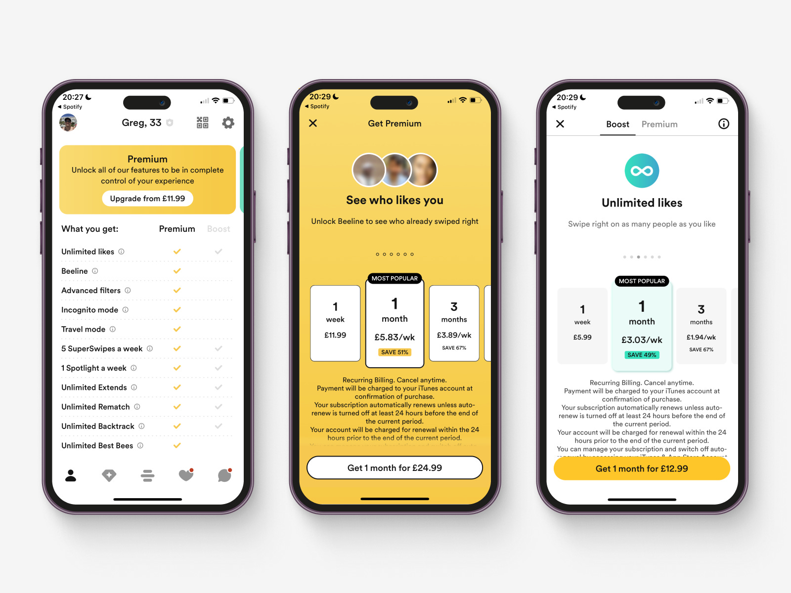
Inconsistent Communication of Paid Plans
Below, you'll find three screens that share a common purpose - choosing a plan. While some design nuances may vary depending on the user journey, it's essential to ensure a cohesive and consistent experience when communicating payment options. Design debt can accumulate when different patterns are used to convey the same information, resulting in negative consequences from short-term design decisions.
To improve the user experience and increase conversion rates, these payment plans could be communicated in a more unified way with subtle variations based on the context of the screen. By doing so, Bumble can reduce design debt and create a more robust and thoughtful design solution. Users will find familiarity in the consistent presentation, making the process clearer and more seamless.
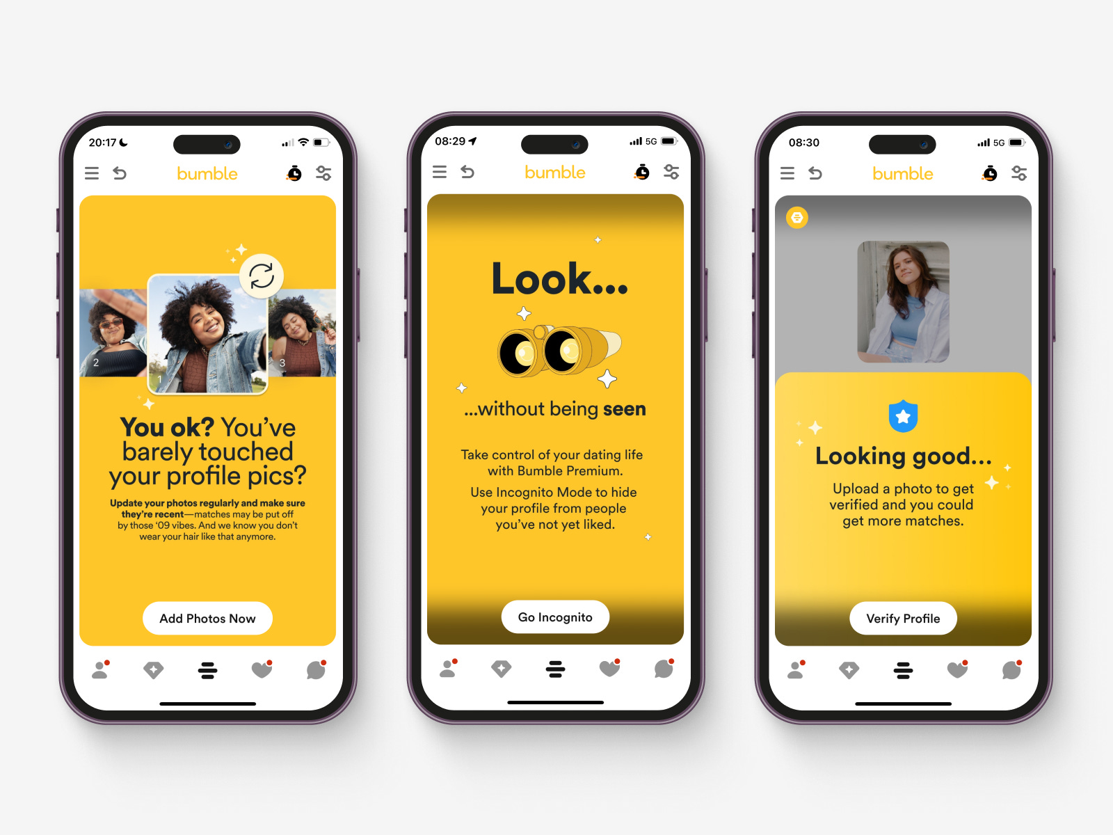
Misplaced Tips in the Matching Section
Whilst I love the concept of providing tips, I can't help but feel that their placement is completely off. As you can see in the examples below, the left screen displays a tip about improving profile pictures, which is undoubtedly valuable for increasing matches. However, presenting it in the same area where I'm trying to match with people feels out of place.
Wouldn't it be more logical to have these tips in the profile section, where users actually edit their pictures? Although placing them on the matching screen may ensure they are seen earlier, it often results in me dismissing them as they appear like random advertisements due to the lack of context.
By relocating the tips to the appropriate profile section, users will likely find them more useful and relevant, leading to a better user experience.
Wrapping Up the Date: Final Thoughts on Bumble
In the world of dating apps, the matching algorithm is undeniably a critical factor, and for me, it's the dealbreaker with Bumble. The foundation of the experience lies in swiping, and the accuracy of the recommended profiles plays a pivotal role. However, Bumble still has some work to do in this department, and it may take time to reach a stage where the recommendations truly hit the mark. Addressing this aspect will be crucial for enhancing user satisfaction and overall success on the platform. Now this might very well be my own experience, which I hope is the case.
Additionally, Bumble would benefit from refining how they utilise specific components like cards and ensuring the consistent presentation of their subscription plans throughout the app. Contextualising pricing to the user journey will create a more seamless and intuitive experience for all users.
On a positive note, Bumble's innovation shines through, particularly with the exciting Speed Dating idea. Once the taste profile matching becomes more accurate, this feature holds immense promise for creating fun and engaging connections.
Furthermore, Compliments have the potential to be a game changer if fully realised. There is so much more they could do here to push the boat further to create genuine value for users.
One aspect of Bumble that deserves applause is the Safety and Wellbeing section, which serves as a valuable addition for all users. It reflects thoughtful design that fosters a safer and more secure dating environment.
Our next stop takes us to Grindr—a dating app known for sparking passionate opinions within the queer community. Brace yourself for a juicy analysis in our upcoming chapter! Subscribe below, and the next instalment will be delivered straight to your inbox.
xoxo
Greg