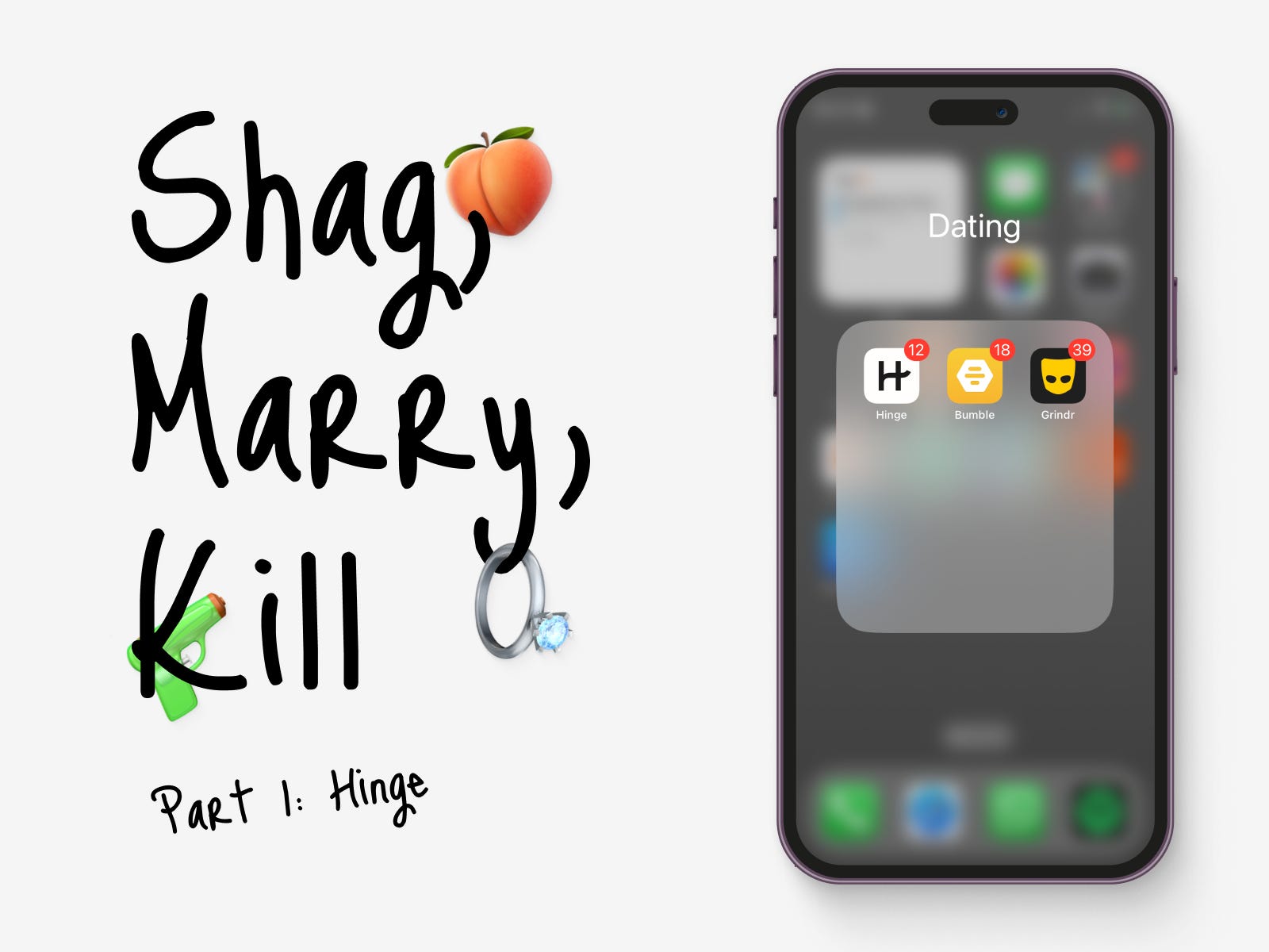
Shag, Marry, Kill: Part 1 - Hinge Design Analysis | How Dating App Design Shapes User Behaviour and Interaction on Hinge, Bumble, and Grindr

Before we start, if you’d like some background on why I’m starting to write, you can find it here.
TL;DR
Starting with a bang, I've decided to shag Grindr, get wedded with Hinge, and bid farewell to Bumble. Now, let's unpack that, starting with the Hinge! 😉
Introduction
Welcome to a captivating world of dating app behaviour! Have you ever noticed how people's behaviour on dating apps can vary, even within the same person using different platforms? It's interesting how the design of these apps influences our interactions. In this three-part series, I'll share my observations as both a user and a designer, uncovering the impact of design choices and features on user behaviour in Hinge, Bumble, and Grindr. Don't worry; we'll keep this journey office-friendly as we dive into the fascinating world of dating app behaviour and its role in finding love.
Now, before we begin this date with Hinge, I must make a little disclaimer: while I haven't been behind the scenes of any dating app development, I do possess a keen eye for design. So, consider my insights subjective but infused with a sprinkle of wit and wisdom.
Real-World Examples of How Design Impacts Behaviour
Before we dive into the exploration of dating app design, let's take a quick detour to the physical realm. In our everyday lives, colours, angles, textures, and space have a significant influence on our behaviour. You've probably experienced the calming effect of a well-designed space, the allure of a beautifully curved staircase, or the energising vibe of a room filled with natural light. And guess what? The digital world has the same power.
For example, let's consider the intriguing case of a colour experiment conducted in the 1980s. Researchers discovered that painting the inside of prison cells with a shade of pink, known as Baker-Miller pink, had a surprising effect on behaviour. This colour was observed to temporarily reduce hostile, violent, or aggressive behaviour among inmates. It's a fascinating example of how small design choices can have a big impact on human behaviour.
Now, let's apply this notion to dating apps and see how design shapes our dating experiences. From the colours used in app interfaces to the layout and convenience of features, every aspect of design has the potential to impact our actions, interactions, and ultimately, our chances of finding love on the internet.
My self-elected Hinge theme song that will accompany you throughout this study
Hinge: “The Dating App Designed To Be Deleted”
The sweet sound of a heartbeat - that's what "Padam Padam" represents. Hinge, famously known as the dating app "designed to be deleted," comes with a clear mission: to help everyone find love. Now, for seasoned daters, that tagline might earn a knowing smile. Hinge stands out for its emphasis on creating genuine connections and nurturing potential long-term relationships.
But here's the question - does Hinge really want us to delete the app? From a business perspective, that might not be the ideal outcome for their growth. And let's face it, the tagline might not resonate with everyone, especially those in open relationships or within the queer community, where the idea of ditching the app might not quite align with their dating preferences.
It's worth noting that Hinge may have overlooked a significant portion of its user base. Surprising as it may seem, up to 30% of gay men are in open relationships, and approximately 50% of gay couples have explored open relationships at some point.
But putting the tagline discussions on pause, let's turn our attention to Hinge's design. The app shows off a sleek and sophisticated interface, reminiscent of Apple's aesthetics. This has a profound impact on user behaviour and experience. The bold titles, clean backgrounds, generous spacing, and smooth rounded corners create a modern premium feel, influencing users in the following ways:
Trust and Credibility: The elegant design creates trust, making users view Hinge as a reputable platform for meaningful connections.
Enhanced User Experience: The intuitive navigation and pleasing visuals keep users engaged, likely leading to longer sessions and increased retention.
Aesthetic Usability Effect: The attractive design evokes positive emotions, making users associate the app with a more enjoyable and rewarding dating experience. They might even ignore usability issues, all thanks to that captivating interface.
Focus on Profiles: The design smartly directs users' attention to profiles, encouraging thoughtful interactions and conversations.
Perception of Quality: That premium feel enhances users' perception of the app's overall quality, making them more receptive to trying out new features.
Now, Hinge isn't without its quirks. One persistent issue I've encountered is being presented with profiles from the opposite gender, despite setting my preferences accordingly. It's like a surprise twist in a romantic comedy—unexpected, but not necessarily unwelcome. Fortunately, the other profile recommendations usually hit the mark, making up for this minor hiccup. Conversations on Hinge are a whole different ball game compared to platforms like Grindr. The vibe is more respectful, the pace is just right, and it's all about getting to know each other on a deeper level. It's like strolling hand-in-hand through a digital park, taking the time to smell the virtual roses.
How Hinge Works: Understanding the Mechanics of Connection
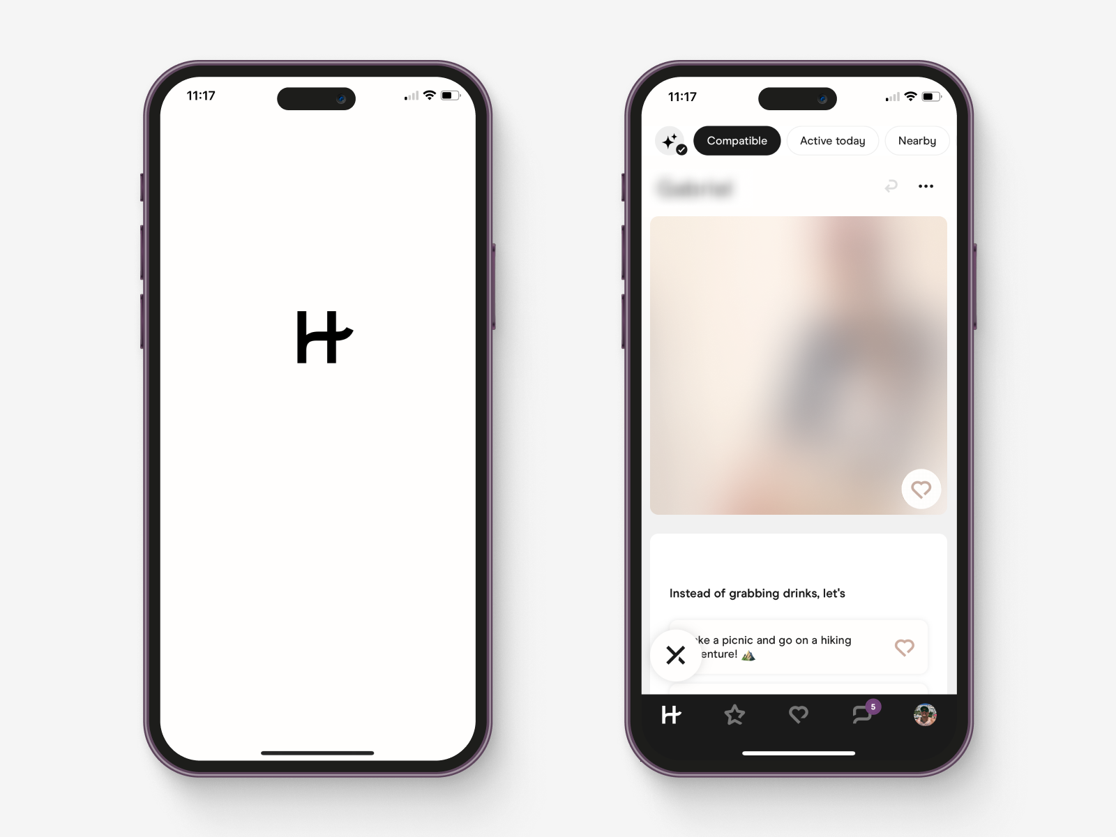
Now that we've dived into the design aesthetics of Hinge, let's take a closer look at how this app actually works. Hinge presents us with five core screens, neatly tucked into the tab bar at the bottom of its interface. Let's unpack them from left to right.
Screen 1. Home: Where Potential Matches Await
Unlike the frenzy of swiping through a multitude of profiles on other apps, Hinge takes a more considered approach—presenting one carefully selected profile at a time, selected just for you. It's like having a personal matchmaker who knows your taste better than you do (they're pretty good at it). Hinge's recommendations often hit the bullseye, leaving competitors like Bumble and Tinder in the dust.
So, what's Hinge's secret to success? It's all about their detailed profiles! They've moved away from the typical swipe game seen on Tinder and embraced a more profound approach. Hinge encourages users to share lots about themselves, giving you a full picture of their personality and interests. And the icing on the cake? Hinge's taste profile algorithm learns from every like and dislike, always fine-tuning its recommendations. It's like having a data-driven dating wingman, but in the most delightful way possible.
Prompts and Voice Notes: Adding Sugar and Spice To Profiles!
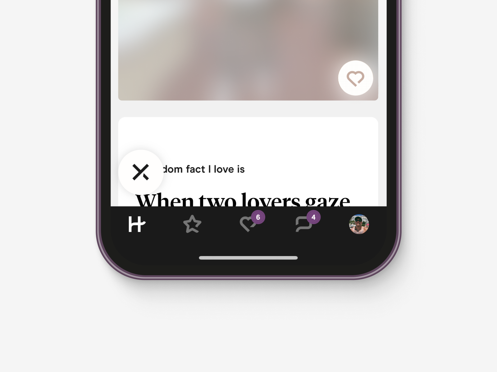
Introducing the prompts! These often humorous conversation starters add a splash of excitement to profiles, a clear effort to ditch the same old "Hi, how are you?" routine and inject some fun into that first message. With Hinge, you can attach prompts to photos, text snippets, or even voice notes, allowing your personality to shine through. This opens up your profile to numerous discussion points, significantly increasing your chances of landing that coveted first date. Hinge goes beyond appearances; it's all about substance and style. They encourage profiles to complete a voice note prompt—an opportunity to hear the real person behind the profile, complete with accents that can either be a delightful turn-on or a hilarious surprise.

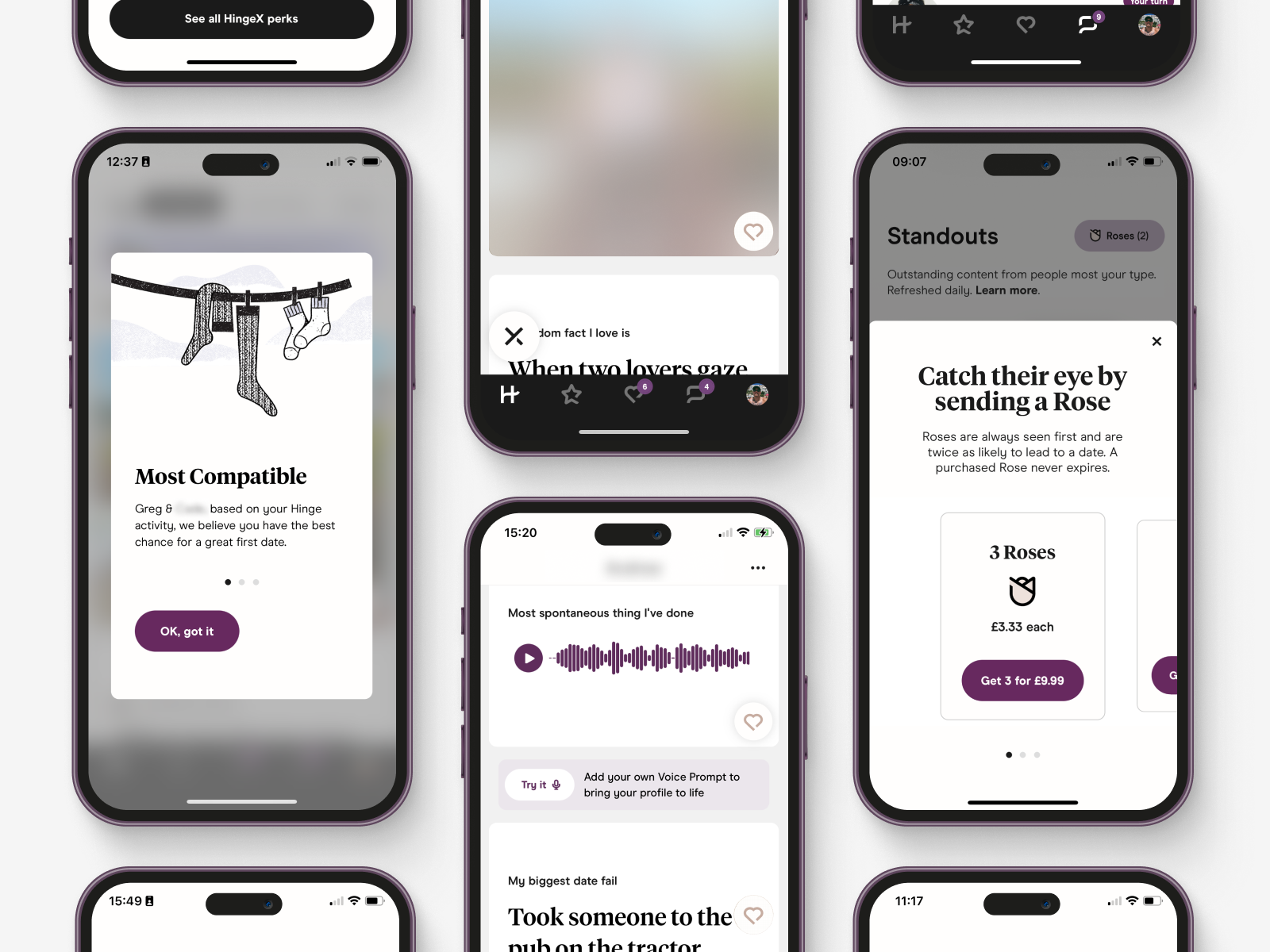
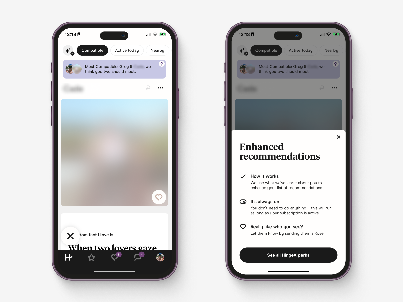
The Design Magic of the 'Most Compatible' Banner
When you spot that coveted "Most Compatible" banner at the top, you know there's something exciting in store. Hinge claims these profiles have an 8-times-higher chance of turning into a real date. However, I must admit, I'm not entirely convinced. I've come across a few of these banners, but personally, I didn't feel the profiles were a perfect match for me.
But how does Hinge determine who earns a banner? They've got their matching algorithm working overtime, handpicking a select few from the upper percentages of your taste profile. These profiles are the cream of the crop, carefully chosen to maximise compatibility and increase your odds of finding that elusive connection.
But here's where the design magic comes into play. The presence of the "Most Compatible" banner itself can significantly influence user behaviour. It creates a sense of intrigue and allure, making the profile stand out from the rest. I can't help but wonder if there's a cause-and-effect dynamic at play. Are users more likely to go on a date with someone because of the presence of the banner? Would the profile receive the same level of attention without it? It's fascinating to consider but it highlights how the design of this element can shape user behaviour and potentially lead to meaningful connections regardless of its intention.

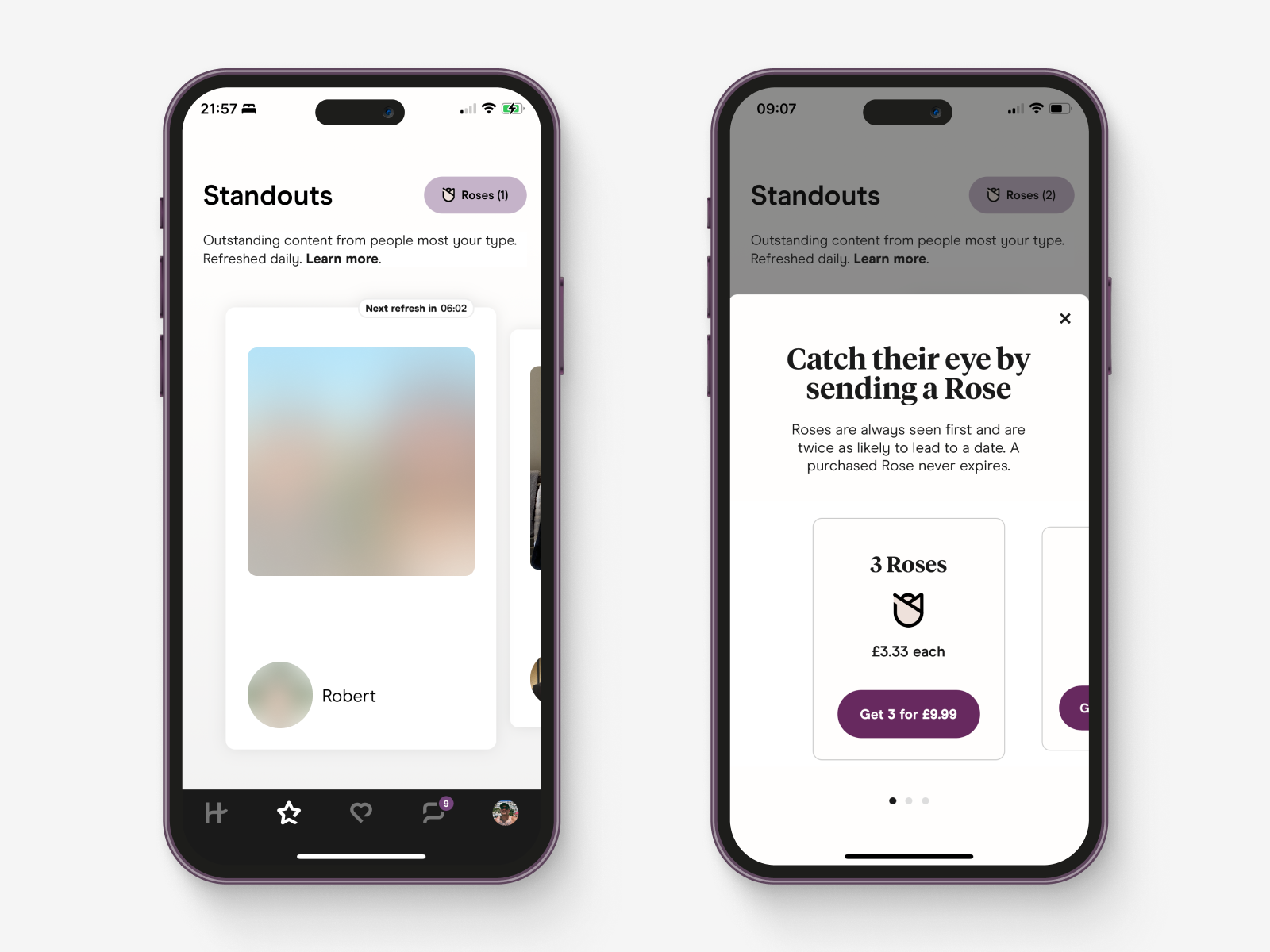
Screen 2. Standouts: Where Profiles Shine Bright
In the Standout section, Hinge goes all out to showcase profiles that are a strong match for your taste. When you launch the app, keep an eye on the animated star icon; it signals fresh new profiles just for you. These profiles are the best of your taste profile, handpicked by Hinge's recommendation algorithm. But here's the sneaky part—by sectioning off these profiles from the Home screen, Hinge cleverly leverages their algorithm to sell virtual roses. It's a way for them to monetise your preferences and add an extra layer of exclusivity to the experience. They know that when you're presented with profiles that align with your taste, you're more likely to invest in unlocking conversations with these standout profiles.
Upselling virtual roses 🌹💸
In Hinge's Standout section, to chat with someone you’re interested in, you'll need to send a virtual rose—a clever way to create that special spark. These tokens unlock conversations with alluring profiles, blending data-driven insights with romantic flair in a charming dance.
But beware, the temptation of sending roses can be thorny. At £9.99 for three roses, or £69.50 for fifty (I see what they did there), it's like virtual assets at your fingertips, calling for you to invest in promising connections. While it feels delightful to receive roses and go on dates with admirers, I’ve had to exercise restraint to avoid overspending which has meant I’ve neglected this area almost completely.
As much as I adore Standout profiles, I can't help but wish they were integrated into my home screen without an additional cost. It almost feels like the app is saying, "Designed to be deleted at any cost to the customer."
Yet, patience pays off. After a while, those exclusive profiles often find their way onto the home screen, allowing you to explore connections without relying on virtual roses. In the world of dating apps, patience is truly a virtue.
Onto subscriptions—while Hinge offers monthly memberships, it might leave you wishing for a few extra roses to sweeten the deal. Roses are exclusive one-off purchases that are not part of any membership tier.
💡 Idea: Dear Hinge, let's get crafty with roses and payments
Here's an exciting idea: Why not allow users to pay for memberships directly on the web? By bypassing the Apple tax from in-app purchases, you can save costs and give us a little something extra—free roses! Who doesn't love free roses? 🌹
Imagine this: When users sign up for a web-based membership, surprise them with a complimentary bouquet of roses. It's a win-win. You encourage web payments, save money, and we feel extra special as we embark on our dating adventures.
By embracing web payments, you can invest those saved funds into making Hinge even more extraordinary. Enhance the user experience, fine-tune the recommendation algorithm, and introduce innovative experiences that set Hinge apart.
So, Hinge, let's get crafty with roses and payments. Embrace the web, skip the Apple tax.
With love and anticipation, Greg.
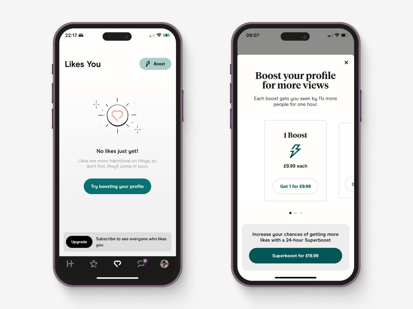
Screen 3. Likes You: Where the Admirers Reside
This section houses the profiles that have expressed their interest in you. However, you can only see one profile at a time, unless you subscribe to a paid membership that unlocks the full list of admirers.
The membership upsell here raises some questions about its true benefit. After all, even without it, you can still choose to start a conversation or dismiss each profile in this section.
Boosting Your Visibility: The Upsell Dilemma in Hinge's Likes You Section
Within the context of profiles that like you, Hinge introduces another upsell: Boosts. These boosts claim to put you at the front of the queue when other users are navigating the app, increasing your chances of visibility and potentially leading to more profiles appearing in your Likes You section.
However, the pricing of Boosts gives pause for thought. At £9.99 for one boost that lasts a mere 1 hour, it seems a bit on the expensive side. And if you're looking for a longer boost, a Superboost that lasts 24 hours will set you back £19.99. The limited duration of these boosts might make one question their true value. Even if the £9.99 boost lasted a week I highly doubt I’d pay for it.
It was on this screen that I decided to take the plunge and invest in Hinge X by clicking on the upgrade button in the toast at the bottom of the screen. I couldn't resist the temptation of unlocking the potential for even better recommendations. With Hinge X, I hoped to discover a selection of profiles that truly aligned with my preferences and aspirations.

Understanding Hinge's Membership Options: From Hinge+ to HingeX
HingeX: The VIP Experience
Let's dive into Hinge's membership options, starting with Hinge+, designed to enhance your dating journey. Then, we have HingeX, the top-tier membership promising next-level recommendations. The allure of HingeX lies in their mission to provide the best possible matches, making it a coveted feature.
VIP Treatment: "Skip the Line" and "Priority Likes"
Now, let's talk about the goodies you get with HingeX. There's the mysterious "Skip the line" and "Priority likes" features. From what I gather with HingeX, your profile will be recommended sooner, as if you're getting a VIP pass to the front of the line. Of course, this feature is only really beneficial if you’re pushed to the front of the queue for profiles that you are interested in.
Unlimited Likes: A Curious Contradiction
Both Hinge+ and HingeX offer unlimited likes, yet the free membership claims to encourage more thoughtful liking by restricting the number of likes you can make in 24-hours. Does that mean thoughtful liking does not apply to paid subscriptions or is it just an enticing upsell strategy? You decide. 🤔
Filters for the Perfect Match: Your Personal Dating Assistant
HingeX also grants you access to additional filters on the home screen. With filters like "Compatible," "Active today," "Nearby," and "New here," you can fine-tune your search and find your perfect match with greater ease. What's even more impressive is that when you apply a filter on a HingeX plan, the enhanced recommendations apply to all filters. Now, I realise this is an app aimed at dating but I think Hinge missed the mark in particular to queer relationships where there are all sorts of additional preferences like tribes, kinks, etc.
💡 Idea: Dear Hinge, Embracing Diversity and Inclusivity
Let's address the elephant in the room: the app may seem a bit straight-leaning. While your matching algorithm is impressive, I believe there's an opportunity to enhance inclusivity and empower users to have more control over their dating experience.
As a dating platform that aims to help everyone find love, it's essential to recognise and cater to the diverse preferences and sexualities within the LGBTQ+ community. Consider allowing users greater freedom to explore their preferences and sexuality openly. By embracing various identities and relationship dynamics, you can create a more inclusive space for queer individuals.
One crucial aspect to consider is introducing kinks into the platform. This step may help defeat kink shaming in the community by normalising diverse expressions of sexuality. By offering kink-friendly options and encouraging open conversations about desires and boundaries, you can foster a culture that embraces sexual exploration without judgment or stigma.
Providing options for users to specify their tribes and kinks can be a game-changer. This feature allows people to connect with others who share similar interests, fostering a deeper sense of community and understanding. It's a core part of many queer people's experience and can help build meaningful connections beyond just romantic ones.
Additionally, making it easier for individuals in open relationships to find like-minded people can add value to your platform. By providing a clear option for those seeking non-monogamous connections, you acknowledge and validate their experiences, helping them feel more comfortable and accepted.
In your mission to help everyone find love, embracing diversity and creating a more inclusive environment will undoubtedly resonate with a broader audience.
With love and anticipation, Greg.
P.S. 🏳️🌈
Price Plans: Making a Calculated Choice
When it came to selecting a membership plan, I weighed up the price options. The 1-month plan at £44.99 seemed a bit steep, and honestly, committing for just one month didn't feel like enough time to fully explore the app's potential. That's why I settled on the 3-month plan—it provided better value (it’s still a staggering £89.99) and gave me more time to immerse myself in the Hinge experience.
Misalignment of Pricing and "Designed to be Deleted"
Here's where things get intriguing. The pricing plans don't precisely align with Hinge's renowned motto, "The dating app designed to be deleted." It's a head-scratcher: if their mission is for us to find love and bid farewell to the app, why offer a 6-month payment plan? Wouldn't a monthly rolling membership or a 3-month plan be more fitting? The absence of a yearly plan makes sense, as it could be contradictory to their mission. It leaves me pondering the rationale behind their pricing choices, but nevertheless, I'm committed to the journey.
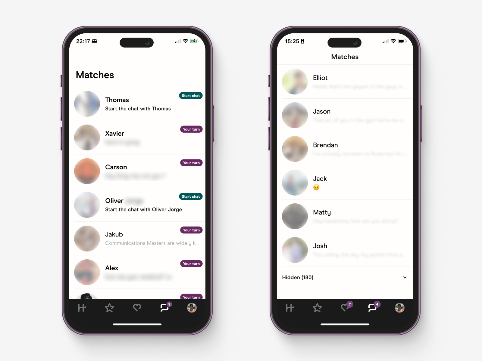
Screen 4. Matches: The Message Centre Where Profiles Die or Thrive
Message status labels: In this pivotal section, Hinge's clever design shapes the fate of profiles and conversations.
The "Start chat" label nudges you to keep the conversation alive—a common struggle in dating apps.
The persistent "Your turn" label encourages ongoing dialogue, ensuring connections don't fade away.
Hinge sparks engagement with prompts on profiles, encouraging meaningful interactions from the start.
Hidden Chats: A Double-Edged Feature
Hidden chats, with their ups and downs, aim to clean up the chat list and prioritise recent conversations as indicators of willingness to meet in person. However, I have reservations. When I don't log in for a while, all my conversations are hidden, creating a chat graveyard where potential connections fade away. Resuming these conversations becomes challenging when they're not immediately visible, adding friction to the process. A clearer separation between recent and older chats would be preferable to avoid missed opportunities and a sense of disconnection when returning to the app. Striking a better balance could maintain connections and rekindle potential matches when users come back after a break.
Unique Chat Features and Unmatching on Hinge
Intriguingly, Hinge has taken an interesting approach within the chat interface by omitting the ability to send pictures to a match. Instead, users can send voice notes and even have live video calls. While the reason behind this decision remains unclear, I speculate that it may be to prevent the sending of unsolicited images, which can be a common issue in dating apps.
This feature might have a different impact on heterosexual matching compared to queer relationships. In my experience, it has been a bit of a barrier, often leading to exchanging phone numbers and moving the conversation to platforms like WhatsApp, where such restrictions don't apply. However, I wonder if this poses a challenge for Hinge to distinguish between users who find dates and return and those who do not.
Within the chat interface, clicking on the ellipsis icon reveals a useful action sheet with four options: "We Met," "Hide," "Unmatch," and "Report." Personally, I've only used the "Unmatch" option. It comes in handy when someone accepts the conversation but doesn't bother to respond, leaving a sense of laziness and lack of effort that can be a bit off-putting.
Screen 5. Profile: Unveiling the Heart of the Hinge Experience
Though not the flashiest of areas visually, the profile section is undeniably crucial to the Hinge experience. It encompasses two main areas, your profile and standard utility menu items, including an educational guide on creating the best profile. This guide might seem like helpful advice, but Hinge's data-driven approach benefits both users and the app itself. Following these tips leads to richer profiles, better algorithm matches, and increased engagement—essentially, more dates and potentially more connection!
Hinge introduces fascinating concepts like voice notes, aiming to break down barriers that hinder connections. Hearing someone's voice early on can be an effective icebreaker and even add a touch of humour to that initial message. It's like a clever workaround for those pesky accent preferences. And don't worry, I'm not leaving my own voice note anytime soon—I'll stick to good old-fashioned text for now! 😉

Profile Screen: Unveiling Your Public Persona
At the top of the profile screen, you can edit and fine-tune your profile to stand out. From photographs to prompts and personal info, it's all here for you to shape.
The profile has three sections: My Virtues, My Vitals, and My Vices. My Virtues showcases your professional life, beliefs, hometown, and dating intentions. My Vitals covers the basics like your name, gender, sexuality, and age—fundamental characteristics for potential matches.
The arrangement of these sections is rather intriguing, as it places more thought-provoking details ahead of the basics. Typically, in a form, you'd find fundamental information like your name and date of birth at the beginning, as they require minimal contemplation. This order is intentionally designed to create momentum and increase the likelihood of completing the form. Alas, Hinge do things in their own way.
Hinge provides the option to hide certain data, granting you control over what you share with others. This feature ensures that some profiles may not display all inputs initially, allowing for privacy while exploring connections. When I come across profiles with thorough information, I find myself more inclined to invest additional effort in my initial interaction. The sense of reciprocation in such instances feels rewarding and fosters a deeper connection from the start.

Wrapping Up the Date: Final Thoughts on Hinge
In the world of monogamous relationships, Hinge shines with its powerful recommendation engine. It consistently serves me profiles that pique my interest. However, their "designed to be deleted" claim conflicts with real-world scenarios, like open relationships in the queer community.
While Hinge's user experience is enjoyable, the pricing can be a bit steep. The trouble with many subscription products is that users will anchor their pricing to streaming services like Netflix and Spotify. Finding a unique pricing strategy aligned with their core value proposition would be a step in the right direction for dating apps.
Ultimately, Hinge stands out as one of the best-designed dating apps, but I can't help but yearn for more real-world innovation in the dating landscape. Personally, meeting people in person for the first time breaks down barriers that pixels can't match.
Now, while Hinge may have its charms, the app Thursday has piqued my interest. Their in-person events and unique one-day-a-week approach seem like a refreshing step to combat dating app fatigue.
Stay tuned next week for part 2 as I delve into an analysis of Bumble! 🐝
Happy dating!